On the Fail Faster #podcast episode, ‘Make it easier, move the napkins, forks & knives to the end of the dinner table!’ we sit down with Ethan Danstrom, VP of UX at @signifyhealth
— InfoBeans (@infobeans) December 17, 2021
Listen here
iTunes: https://t.co/hlZGjedwalhttps://t.co/XzPcUo70hd pic.twitter.com/UnZMD46DeD
Portfolio
There are 7 posts filed in Portfolio (this is page 1 of 1).
Carbonate: Enterprise Design System
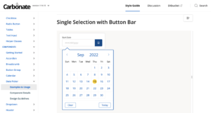
Lead Engineer: Leland Rangel
Carbonate was built from the ground up as a collaborative effort between Design and Engineering. It replaced a multitude of 3rd party libraries being used across the organization with one unified presentation layer for all of the web applications.
The single solution significantly reduced the time it took to ship new features and cut down on time spent testing because we were not building each component from scratch. This took some a little engineering education and even more cultural encouragement. Moving to an enterprise-level workflow for teams that are not used to it takes some care, but everybody benefits in the end.
We also used Zeroheight to centralize design guidance rules as well. There were multiple data visualization tools in play at the time, so we worked to use them constantly even before we consolidated tooling on the engineering side.
Provider Day-Planner Redesign
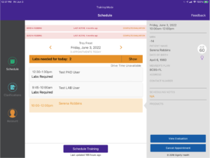
Design Lead: Troy Frost
All of the in-home Health Evaluations are performed on an iPad using our own software. The user and business demands evolved over time, and we found ourselves in a 5-pounds in a 3-pound bag situation.
The new design provided the opportunity to transition to a Swift UI based Design System, as well as address a multitude of user and business needs. The redesign of the Day-Planner view allowed Providers to be better prepared for their visits, and be more clinically valuable while in the Member’s home.
The original design of the Evaluation form was cracking under the pressure of advancing clinical needs.
User & Business impact:
- Realtime feedback on required questions reduced needed clarifications by
- SwiftUI-based design system reduced development time
- UX Consistency across all question types reduced time-on-page
- Reduced the effort to add new questions to the form
Caregiver Journey Map
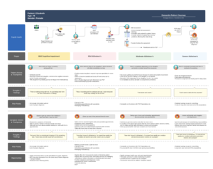
Design Lead: Jay Kuruvilla
Everybody’s day is different, and what can seem like a regular Tuesday for one person, is a life-altering tragedy for another. When we began to build tools to support Caregivers for Dementia patients, this journey map was a fantastic resource for the whole team to gain a more detailed and empathetic understanding of the Caregivers. This template was built out in Lucid Carts so that we could easily share it with teams out of Design/UX and this was critical so that EVERYBODY could contribute more detail and texture to this document.
Enterprise Design Operations
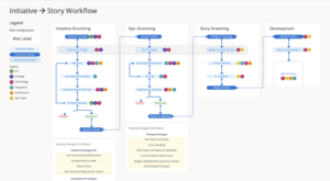
Design Lead: Me
The tools for design are constantly improving, including Design Operations. Typically a RACI document does a great job of telling who is doing what. Sadly it loses the big picture of what the heck we are REALLY doing together. We built out this diagram to describe who is involved at each of the stages, and where the decision gates should be. This diagram also was a great way for non-design people to know when to involve Design, and what to expect from them when they get there.
We collaborated closely with Product and Technology Leadership so that this document was a source of truth for how everybody wanted to work together. It was exciting to see it cherry-picked and showing up outside of Design Presentations.
There was a followup effort to break things out into greater details so that we could configure Aha! to work the way WE wanted to work.
Provider Availability Management
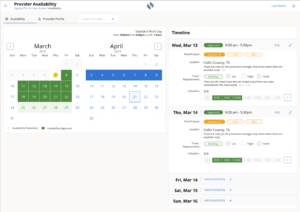
Design Lead: Yolanda Ladia
We can’t book any appointments without having open appointment slots available, and this was REALLY a moving target because Providers changed when they wanted to work a LOT. These updates fell to the recruiting team and the tool they were using was really cumbersome and error prone.
We interviewed multiple recruiting teams and their managers to better understand their current workflow and obstacles. The biggest opportunity was to reduce the scroll hunting and put the most critical information face up (or just one tap away).
New Feature in the new design:
- Color-coded status for availability & travel
- Availability templates for each Provider
- Lunch break support
- Auto weekends
- Bulk plan assignment
Benefits of Carbonate Design System
- Improved legibility
- consistent interaction patterns
- Improved responsiveness
- Reduced initial page load time
Business Impact
- 25% reduction time to enter capacity
- 50% reduction in response time to Provider requests
Call Center Software Redesign
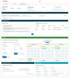
Design Lead: Yolanda Ladia
The Member Engagement Coordinators (MECs) called thousands of Members each day to book a home for a Health Evaluation. Booking an appointment required the MECs to gain the Member’s trust, and the more the software could step aside and let the MECs have a natural conversation, the better.
Original Design
Multiple teams built the original design over numerous years, and it showed. The UI was a grab bag of various libraries, and the growth in capabilities had introduced many friction points. Through UX Research, the MECs told us what would make them most successful, and using our newly minted Design System (Carbonate), we could deliver it with speed and consistency.
New Design
New Feature in the new design:
- Multiple appointments for the same household (spouses)
- Multi-day view of available appointment slots
- Improved email capture
- Improved address validation and landmark support
- Strategic overhaul of Member Notes and Location notes
- Improved accessibility of Outreach History logs
Benefits of Carbonate Design System
- Improved legibility
- consistent interaction patterns
- Improved responsiveness
- Reduced initial page load time
Business Impact
- 2% reduction in cancelations
- 85% increase in email capture
- 25% reduction in Average Handle Time
- 15% improvement in appointments per call