
Overview
One designer and one AI design agent built, in about a week, a prototyping platform that ties every screen and UI element of a legacy enterprise’s tools to the data, business rules and source documents behind it. Two legacy payments applications were redesigned on the company’s React design system as the first proof, with 223 screens, 481 identified components and a clickable prototype on mock data.
The problem. Legacy enterprise tools grow apart: each has its own navigation, tables and patterns, and the business logic behind each screen lives in user guides, release notes, planning papers and people’s heads. A new team asked to build a feature starts with a picture of a screen and no reliable way to learn what it means, who may use it, or which documents say so.
The idea. Treat a design file as a screen plus everything that explains it, and attach that explanation by identifiers rather than free text. Every element points to its data record, allowed values, permitted roles, governing rules and the document and page that state them. A UI pattern stops being a picture and becomes a testable, traceable statement.
Two goals drove it:
- New teams get all available context before deciding how to build a feature.
- Anyone can test any combination of role, permission and account data in minutes, so experiments and user feedback happen almost instantly.
What it produced (first two applications):
| Deliverable | Scale |
|---|---|
| Redesigned screens with notes, data and decision cards | 223 |
| Design system components carrying a permanent ID | 481 |
| Design tokens (variables) in 10 collections | 870 |
| Business rules in data-logic files (second app) | 136 |
| Decision rows, each marked High, Inferred or Assumption | 2,082 |
| Questions answered by the internal knowledge source | 98 |
| Automated checks on the clickable prototype | 488 passing |
| Working documentation | ~125 documents, ~600,000 words |
The back-end connection is not built: the prototype runs on mock data shaped like database tables, so engineering has a direct path to connect it later.
Core principle: one ID, four places
Every screen, drawer, dialog and annotated element carries a short permanent ID, and that same ID appears in four places that are kept in step by rule.
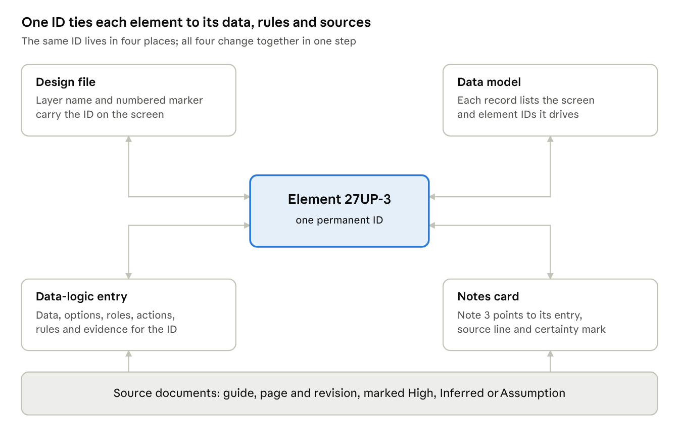
one ID, four places · linked to its sources
Because the ID is the link, nobody can read an element differently without changing its entry, and when a source document changes, every element that depends on it can be found by ID.
Why this matters for UX. A table with a status column, a drawer with an approve button or a dropdown of currencies means something only because of the data and rules behind it. Tying each element to its record, its allowed values, the role that may use it and the document that says so makes the pattern testable and makes drift visible.
A worked chain, for a status chip column on an order list:
- A user guide lists the order statuses on page 98; the knowledge assistant returns the list and progression with that page.
- The data model records 12 statuses and their progression, with the evidence and the open point (allowed transitions, and the role to ask).
- The screen’s data-logic entry lists the statuses as filter options with their source and the roles allowed to filter.
- The design system table shows a chip per status; the note on that element carries its ID, the source line and a mark.
- The decision card records “compliance is a marker beside the status, not a status” as High, with the rejected alternative.
- The prototype reads the same list from its fixtures, and the where-used index shows the chip’s other uses.
If the guide is revised, the superseded index shows what was replaced and the IDs show which screens, entries, cards and fixtures to revisit.
The ID system and certainty marks
Short, permanent IDs are what make the linking work: anything a person might be asked about gets one, and the same ID is searchable in the design file, the docs and the code.
| ID form | Identifies | How it is used |
|---|---|---|
| 27UP | A screen, drawer, dialog, spec card or question card | 4 characters from A to Z and 2 to 9 (no 0, O, 1, I or L), generated once, never reused, shown bold in an accent colour |
| 27UP-3 | Element 3 of that screen | Same tag on the numbered marker, the note and the layer name |
| DS-XXXX | A design system component | Ends the layer name and starts the component description; feeds the where-used index |
| TU-0001 | A test user | Travels in share links, ticket links, feedback and file names |
| F, D, T, B rules | Working method, design decisions, table standard, behaviour rules | Cited in data-logic entries and decision rows |
| AS-nn | An assumption | Every default without a source is logged with its reasoning |
| BR-nn | A business rule | Cited in notes and decision rows |
| S-nn | A registered source document | Has a page map so notes can cite “S1 p.98” |
| CAP-nn, PAT-nn | A capability and the container that delivers it | Counts pattern inconsistencies across applications |
Every statement carries a certainty mark, shown as a coloured chip on notes, data cards and decision rows:
- High: recorded in a current source and cited.
- Inferred: derived from sources or a sister application, with the reasoning.
- Assumption: a default with no source, logged with an AS number.
The result is auditable. In the second application the 2,082 decision rows split into 401 High, 1,593 Inferred and 86 Assumption, and every one of the 86 assumptions has an ID a reviewer can accept or reject.
Data model and data logic: the skeleton of the future back end
The data model is written as screens are read and designed, not afterwards, so it becomes the readable blueprint of the database the experience will eventually connect to.
The data model holds entities, fields, parent and child relationships, enumerations (statuses, roles, payment types) and which roles touch which content. A summary section gives one table per topic (order status, approvals, pricing, limits, beneficiaries, users and so on) with what is known, the evidence, and what is still open with the role to ask. Every record lists the screen and element IDs that show or change it.
A data-logic entry exists for every screen ID and every element ID, written at the same moment as the design. Each follows one template:
- Design node and code files
- Purpose and who uses it
- Data shown or changed: entities, fields, dropdown option sources
- Roles and permissions, including what is disabled and the tooltip that says why
- Actions and outcomes
- Rules applied, by ID
- Reasoning and evidence: source and page, knowledge-source item, owner decision with date
- Open items, and a dated change log
An entry changes only through a dated change-log line, and the design element and its notes change in the same step. If an entry and the code disagree, the difference is raised, never silently resolved.
Rules that keep the model portable:
- Newest information wins. Only the newest version of a fact stays; the replaced statement moves to a superseded index with both sources, dates and authors.
- Old sources are flagged, not discarded. A fact found only in an old document is used, tagged with its year, and queued for review.
- Shared data lives once. Anything two applications share (payees, status lists, authentication methods, approval models) sits in one shared file both data models link to.
- Mock data is shaped like tables. Prototype fixtures keep one array per entity with foreign keys by ID and no nested copies, so moving to a real database is a change to the API layer only.
Living off existing internal documentation
The platform invents no business knowledge: it is a layer over documents the enterprise already has, with a traceable path from each design decision to a document, a page and a revision. The biggest lesson of the project was to ask the internal knowledge source first and design second; screenshots of the legacy UI only fill what the documents leave out.
Source families: user guides and release notes, product requirement documents and business cases, operational desk references and test sheets, guides in a content platform, and the legacy application itself (screenshots, and even its public style sheets).
The research loop with the enterprise AI knowledge assistant:
- The design agent writes self-contained, numbered questions, each mapped to the open question cards it would answer.
- The designer pastes them into the internal assistant, which cites documents with page numbers or answers “not documented”, and saves each answer as a PDF.
- The agent splits answers per item and writes them into the data model, data logic, source register and backlog.
- Answered question cards close with the answer, source, page and confidence.
- Document links hidden inside the PDF citations are extracted into a download list; downloaded documents are read in parallel.
- Further rounds target what is still unknown, until the data model, rules and user profiles are stable.
Every assumption is sent back to the same source to confirm or correct before it is designed or built. After the first rounds, documented facts overrode a batch of early assumptions, and an approved change list updated the designs in one pass.
Limits learned the hard way:
- Circular sources. The assistant indexed the project’s own synced working folder and cited the agent’s notes as evidence. Every prompt now excludes those folders, and facts backed only by project files are tagged circular and not counted.
- “Not documented” usually means the fact lives in live configuration or an unindexed page, so the follow-up asks for document titles, owners and people to ask.
- Misdating. The assistant once called a 2023 runbook a current revision, so prompts ask which version was read and the register keeps each file’s own metadata date.
Source hygiene: source files are temporary but references are permanent (name, link, author, dates, hash, what was used). Every file is anonymised before use, with invented sample data replacing anything that identifies a customer. Document authors and owners become a contacts register of roles and teams to ask, used on notes, data cards and question cards.
Design system engineering
The React design system (its code, Storybook and tokens) is the source of truth, and the Figma library follows it. The library became the single central resource for every component, pattern, handbook and project data-model page.
Order of authority for a conflict: the owner’s latest instruction, then the repository documents, then the design canvas (rebuilt from the documents). Code beats any design library.
Component IDs and the where-used index. Every component ends its layer name with a permanent ID and starts its description with it. Because the design tool does not pass a rename to existing instances, IDs were also pushed into 6,915 nested copies and 567 direct copies. A scan tool walks every file and produces an index: 220 components used in 20,279 visible copies. A code map links matched components to their React component and Storybook page, with Code Connect mappings for developer handoff.
Tokens everywhere. Every fill and stroke binds to a variable (870 in 10 collections), and component fills use component tokens rather than colour primitives so they follow every theme mode.
The legacy look as a theme. The old UI was rebuilt as variable modes inside the same library (colour, typography and shape), so one experience can be shown in the legacy look and switched to the modern one with a button. The target was about 60 per cent likeness: new components must not stand out next to the old UI during migration.
States over variants. A small difference (selected nav item, input error, disabled button, open accordion) is the state of the nested element that changes, never a new variant that copies a whole block. Blocks nest function as well (empty, loading, error, rows selected, read and edit), so complex blocks can later move into the React code.
Patterns versus project blocks. Neutral patterns are named like the code components (data table, detail list, record header, page). Project blocks are thin compositions of them. A page template provides header, body slot and overlay options (drawer, dialog, stacked drawers, menus), so no screen is ever hand-built.
Pattern rules carry meaning. A written table standard (header search, filters, sort, saved views, empty state inside the table), breadcrumbs that follow the data structure rather than click history, drawer-first detail views, disabled-not-hidden actions with a tooltip saying why, and no data changes from the table. Legacy search panels become column filters, and sub-pages that are only other views of the same data become one page with tabs and quick views.
Project changes never touch the published library. A local copy is created, logged with what changed, why, which screens use it and the matching code file, and proposed back to the design system team.
The annotation layer
Every screen carries the same set of cards, and all of them are design system components filled by scripts from data files, so the canvas can be rebuilt from the documents at any time.
| Card | Where it sits | What it holds | Why it matters |
|---|---|---|---|
| Notes card | Beside the screen | One numbered note per marker: element ID, explanation, source line, certainty mark, components used; open notes end with the question card ID and the role to ask | Turns a picture into cited statements |
| Data/Logic card | Beside the notes card | Per rule or record: roles and permissions, up to 8 other screens that use it (and 4 in other apps), contacts who know it | Shows the impact of a change beyond the screen in view, including the sister application |
| Decision card | 40 px below the screen | Five fixed columns: decisions (marked), data logic used, reasoning, rejected alternatives, open or will revisit | Locks in what was decided so later sessions cannot quietly re-decide it |
| Question card | Left of the page, on the row of its screen | One open question, its context, progress, contacts and the answer once closed | Makes unknowns visible and answerable in place |
The re-read rule makes decision cards work: before changing a designed page, the agent reads its card and changes only what new evidence forces. That is the main guard against design drift across many AI sessions.
The “other pages where it is used” list is never hand-written. It follows from the page IDs on each data record, so two screens that read the same record appear in each other’s card automatically.
Comments become attributed answers. Anyone comments on a card in the design tool; the agent reads every comment each session, ties it to the question ID and records who answered. Partly answered questions split: the answered part closes, and a narrower new card opens beside it with a progress strip (asked, partly answered, open part, answered) and a clarity bar such as “1 of 2 parts answered (50%)”. Open cards are peach, answered cards mint, and closed cards move further left so open ones stay nearest the screens.
An interaction pattern log maps each screen to a capability (what the user is trying to do) and a container (page, drawer, dialog). A matrix then counts deviations: one capability delivered in different containers within or across applications. A deviation is not automatically wrong; the log makes it a decision for the owner.
The clickable prototype and the test user dashboard
The prototype is what turns the platform from a record into an experimentation tool: any role, permission and account-data combination can be tried in minutes without a real account.
Prototype architecture:
- Plain HTML, CSS and JavaScript with no build step, so it can be zipped and shared.
- Design-system look-alike components (data table, select with flags, page header with central breadcrumb, drawers, dialogs, chips), wrapped so the real React components can replace them without touching the screens.
- One fixtures file and one mock API per area; the API returns exactly the shapes the data model describes.
- Privileges as first-class code: a can(key) check, a guard that returns a disabled button with a tooltip naming the missing privilege, and a no-access page. 26 privilege keys in groups.
- 8 test pages run headless with 488 checks passing and zero console errors.
- Code follows design and design follows code: anything the code shows that the design file does not is drawn in the same batch.
A test user is a mix of a role template, a client, individual privileges, account settings and a data scenario (24 scenarios, such as a typical day, a busy approver, an empty new user, compliance holds or read only). Every count stays editable.
What the dashboard does:
- List, create, edit, share and delete test users in a standard table; 14 seeded users chosen for variety.
- Test as this user: menus, actions and data follow that user’s template, privileges and its own copy of the data, with a header showing who is being tested and a stop action.
- Profile-menu test tools: reset test data, share this test user, switch user, and appearance switches (light or dark, legacy or modern).
- Share and ticket links: the test user ID travels in a URL parameter and in the linked ticket, so a reviewer opens the exact context.
- Design feedback window: on every screen, showing the tester’s ID with a copy button, a link to the matching design page and an upload link for supporting files.
- One switch removes all prototype tools so they never reach production.
Why it was designed this way: privileges decide what is shown, hidden or disabled, so a reviewer sees exactly what a read-only user or an approver gets. Data per user means testers do not collide. The ID in every link and file name ties each piece of feedback to the exact context the reviewer saw. Every name, client and number is invented.
Working method: one designer and one AI design agent
The designer owns every decision and every library publish; the agent writes design content through scripts, runs the research rounds, keeps the documentation and builds code only on an explicit command.
Order of work:
- Research first: knowledge-source rounds and source registration until the data model, rules and users are solid.
- Design first: screens in the design tool with notes, data card and decision card.
- Review: the agent hands over a numbered list with design links and IDs; questions come last, numbered, so they can be answered by number.
- Build only on command, then bring the design file into step with the code.
The batch method, one batch per area: a data spec drafted by a sub-agent from the data model and test profiles; design system blocks started from the sister application’s matching block; screens, notes, markers and data cards; then documentation, commit, backup and sync. Decisions that do not block go to a backlog with a stated default, so work continues; only a real blocker stops it.
End-of-batch upkeep: update every affected annotation and run the marker check; update the repository documents (handoff, data model, IDs, questions, progress report); push changes to the handbook pages; log every changed page with type, what, why, who and date; commit locally and back up; nothing leaves the machine without the owner’s go-ahead.
Documentation as a system: a handoff file with a “resume here” section that a session-start hook reads first; a backlog of decisions, assumptions and questions; handbook masters kept in the repository and pushed to the design library; a progress report for approvers; and scripts that recount sessions, prompts, tool calls, commits and design objects. Rules that exist only in the agent’s memory are written into the guidelines the same day.
Effort, as a measure of the method: 469 prompts from the designer, 7,556 tool calls, 2,635 design-tool scripts, 748 verification screenshots, 305 commits and about 82 hours of active collaboration (estimated from session logs).
Lessons learned and how to reuse the method
The method transfers to any legacy enterprise with a component-based design system and a body of internal documents; what it needs is discipline about IDs and evidence, not special tooling.
Lessons:
- Ask the documentation first, then design. The first application was designed on assumptions the documents later overrode; the second started from data and rules and needed far less rework.
- Make every assumption visible and numbered, so a reviewer accepts or rejects it instead of discovering it inside a design.
- Keep the four-way link intact. An element changed without its entry, note and decision card degrades the system quickly.
- Beware circular sources. An AI knowledge assistant that indexes your working files will hand your own notes back as evidence.
- Compute counts; never remember them. One agent-reported “63 rows” was really 59, and wording must not outrun the data (“fully functional” means clickable on mock data).
- Prefer states over variants, nest function, and build new beside old when restructuring.
- Publish carefully. Verify the library publish landed, in the right file, with every new item included, and re-link instances by script when an update misses them.
- Do not delete what you did not create, and scope every cleanup script to the right page.
- Redact before sharing. Contact lines on a data card once revealed employee names in a shared image.
- Parallel agents need private folders and verification of bulk writes by hash.
Starting a new application the same way:
- Set up one repository with the standard document set, the same design-file page structure and the design system as the only library.
- Ask about ten numbered setup questions.
- Run a broad first round with the knowledge assistant and save the answers.
- Extract source links, download and review the documents in parallel.
- Run further rounds until the data model, rules and users are stable.
- Inventory every legacy screen by menu area.
- Design in batches with notes, data and decision cards.
- Build only on command, and keep design and code in step.
Open next steps: decide the back-end connection approach and name an engineering owner; move the prototype onto the production React packages; host it for reviewers and run a testing round with shareable test-user links; bring more applications under one shell with shared navigation, login and profile.