

600mm · f/6.3 · 1/250s · ISO 200
Taken Jul 21, 2026 at 7:14 pm
Processed with DxO PhotoLab 10.2.0
Camera: Sony a7R IIIALens: 150-600mm F5-6.3 DG DN OS | Sports 021
600mm : f/6.3 : 1/250s : ISO 200
© Ethan Danstrom Sr.
For years I could see experiences I couldn’t get built. The irony of “AI” is that it doesn’t “I”, but it cracks rocks like a champ while I finally get to stop telling and start showing.
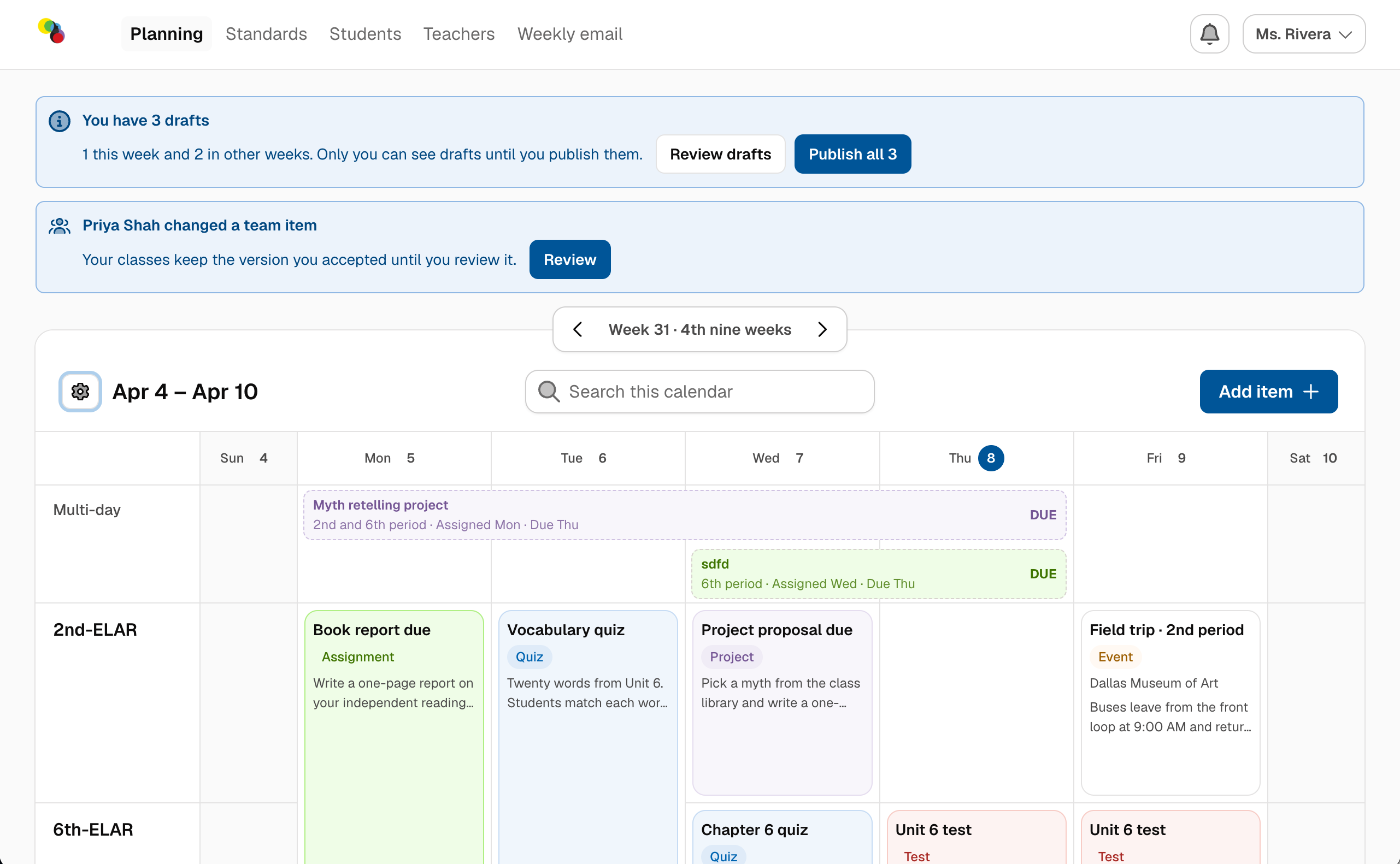
It started as a mess
Comunli Calendars is a calendar app for teachers and guardians, built as a side project and piloted with real middle-school teachers. It started as a free-for-all. I threw a pile of my old Figma designs, from half a dozen design systems, at Claude and let it rip. Hand-drawn icons, colors and type all over the place.
But the back end was real: Supabase for the database and sign-in, Google OAuth, Resend for email, Geoapify for address lookup. That was enough to prove the core idea worked, and enough for me to click through the UX at a resolution no prototype had ever given me.
I’ve used Axure for years. It had real text fields, which Figma STILL doesn’t, but it choked on big component libraries. Figma handles components fine and is a total dog’s breakfast at prototyping. This beat both, because it’s the real thing.
Then we got disciplined
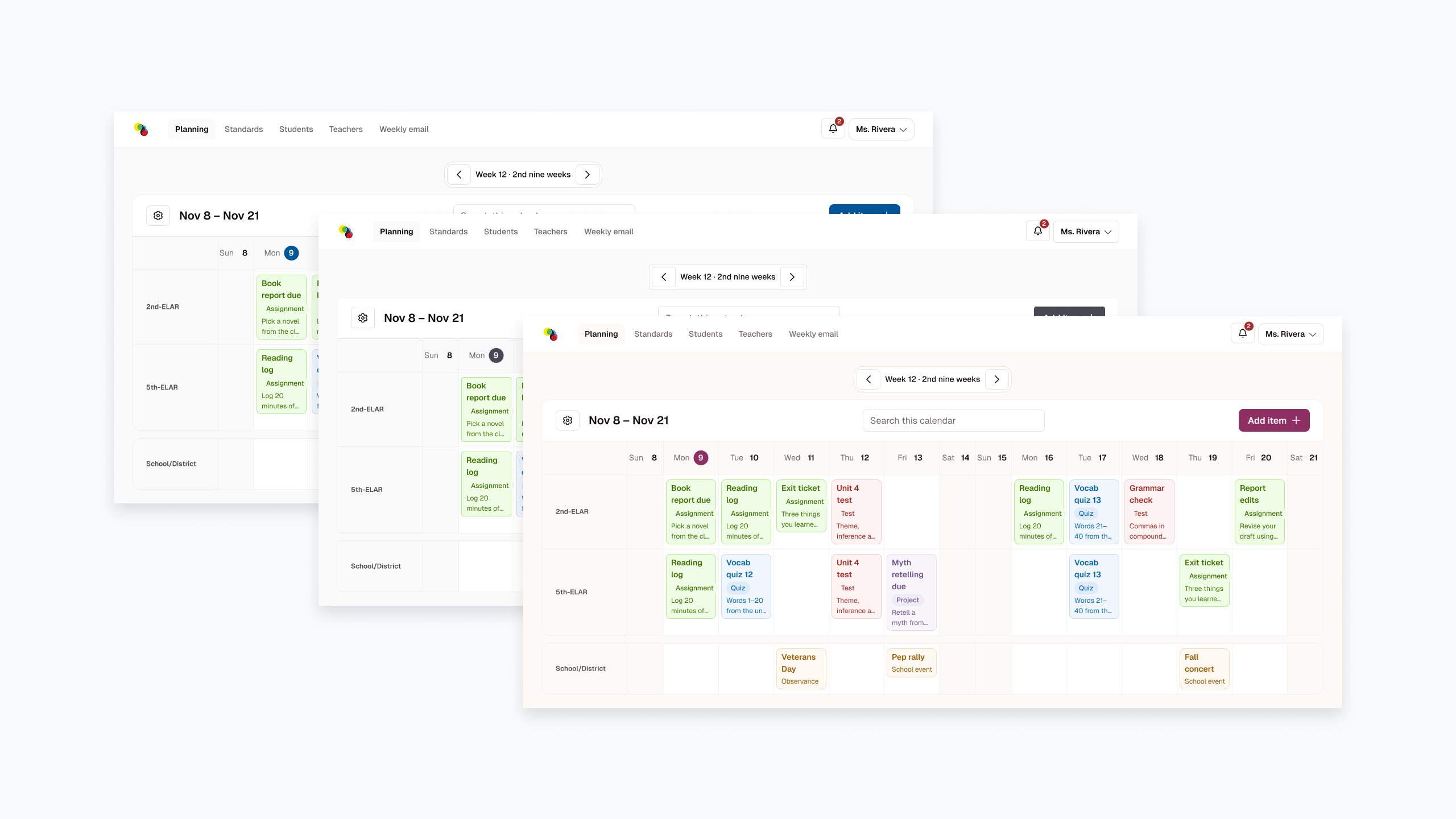
First we moved everything onto one system, Untitled UI and its React starter kit, so the designs and the code finally matched. Then, for the final pass, we rebuilt every screen on Leland Rangel’s Pitchfork design system.
Pitchfork only existed as code, so Claude and I built its Figma library from scratch, straight from his components and tokens. Now there are zero custom elements in the design file. Every screen is components and variables, end to end. Change a token, and every screen follows. We tried to go further and map Figma components straight to code, but account issues blocked us. That’s next.
The Figma Pitchfork library is free on the Figma Community
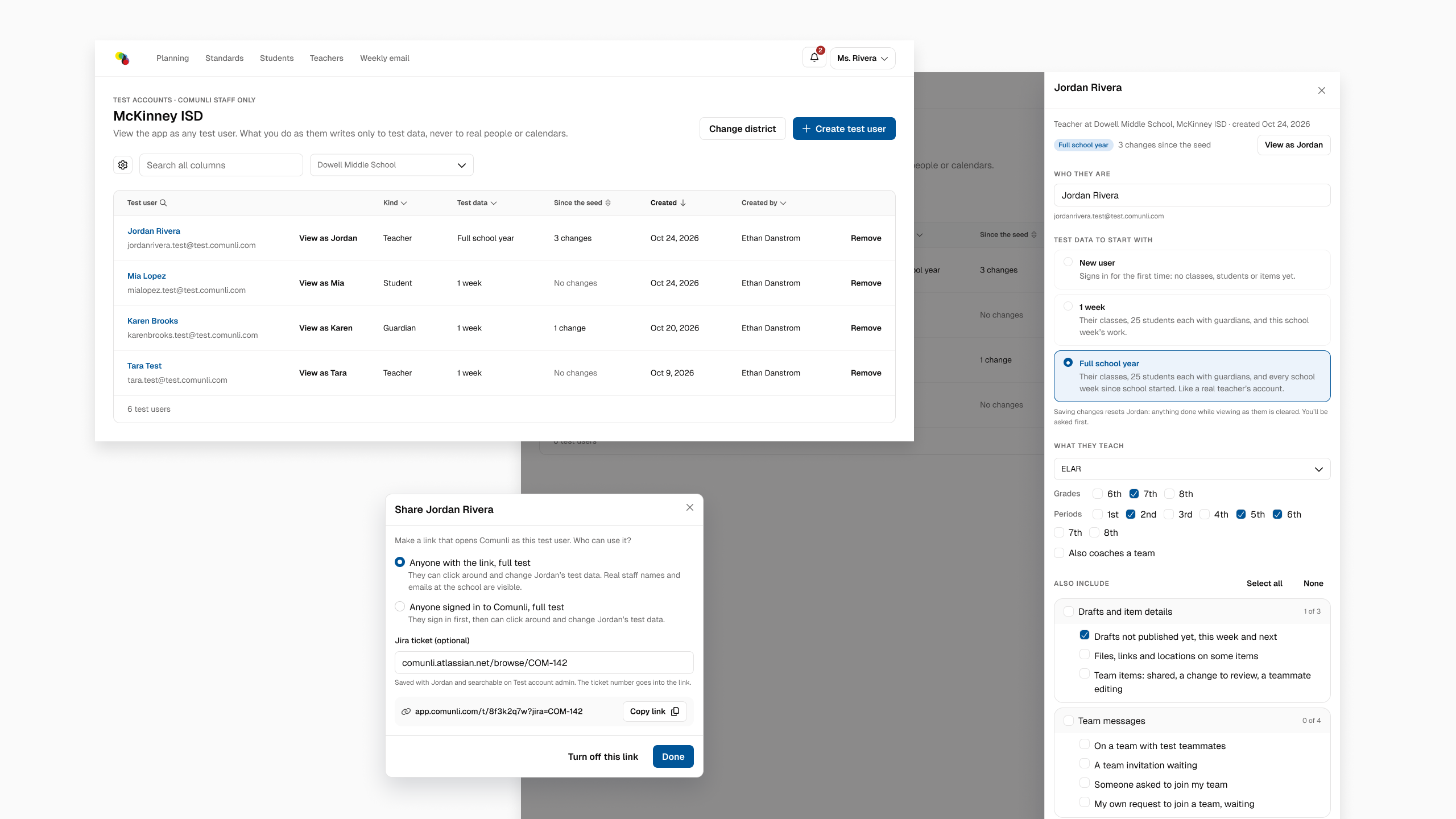
The moment it blew open: test users
I realized I could create test users with exactly the permissions, history and activity one specific experience needs. So I invested in a real admin tool for creating and managing them.
The biggest feature: a unique URL with controlled access. I build a user for one very specific experience, send the link to an executive, and they see EXACTLY what we could do for our customers.
Enterprise software is brutal to design. The experiences are hyper-specific and buried in legacy data. Good ideas die because they look expensive, and they look expensive because nobody can see the difference they’d make. One URL and I can SHOW, NOT TELL: fix this data issue, and THIS is what you get.
How we worked
Short blocks of work with constant check-ins. Claude built, I tore it apart and steered.
One example: I had an idea for the date picker in the event drawer. I sketched it in Figma with plain rectangles and a precise description. A few rounds later we had a working picker that reshapes itself to match how you’re thinking about dates at that moment.
Pictures won’t suffice, you will need to live it yourself.
In every design review I see dozens of little things that should be better. Now I can conjure them in a moment. I’ve always struggled when someone asks, “What’s the transformative feature?” The honest answer is incredibly unsexy: it’s about 100 small things.
With my team I have a saying: “We can’t save all the kittens.” We’ve never had the budget to fix ALL the crap we see, so we save the ones with good ROI, even though we always knew we should be saving them all. Now I can save all the kittens, and the world actually does get better.
What AI was actually good for
I’m not a fan of the “AI makes everything” hype. What I loved was offloading the rock-cracking: endless auto layout tweaks and hunting for fake email addresses so a table looks real. That’s the grunt work that HAS to happen before anyone gets your idea.
And because I hadn’t sunk hours into each option, I didn’t love any of them. We all love our own work, and even a sliver of fondness keeps us from being as cruel to shit design as we should be. With three options in front of me, I could keep, kill and rework faster than ever.
I spent more time actually DESIGNING than I have in years. I was a one-man wrecking crew, bending database logic and JavaScript transitions to my whim, with no prototyping team behind me.
The point
None of it is production code, and that’s not the point. What we can now hand to engineering is the highest-res damn prototype they’ve ever seen. Static Figma screens linked to a Jira ticket feel like a Geneva Convention violation by comparison.
Poke at it yourself
Website and live demo, no sign-up: https://comunli.com
The app: https://app.comunli.com
Pitchfork Design System for Figma: https://www.figma.com/community/file/1701828138888896834
Not covered in this post
- Sharing the Experience URLs with go-to-market teams
- Guerrilla user research
- Legit experimentation
…the list just goes on and on.