On the Fail Faster #podcast episode, ‘Make it easier, move the napkins, forks & knives to the end of the dinner table!’ we sit down with Ethan Danstrom, VP of UX at @signifyhealth
— InfoBeans (@infobeans) December 17, 2021
Listen here
iTunes: https://t.co/hlZGjedwalhttps://t.co/XzPcUo70hd pic.twitter.com/UnZMD46DeD
Carbonate: Enterprise Design System
Lead Engineer: Leland Rangel
Carbonate was built from the ground up as a collaborative effort between Design and Engineering. It replaced a multitude of 3rd party libraries being used across the organization with one unified presentation layer for all of the web applications.
The single solution significantly reduced the time it took to ship new features and cut down on time spent testing because we were not building each component from scratch. This took some a little engineering education and even more cultural encouragement. Moving to an enterprise-level workflow for teams that are not used to it takes some care, but everybody benefits in the end.
We also used Zeroheight to centralize design guidance rules as well. There were multiple data visualization tools in play at the time, so we worked to use them constantly even before we consolidated tooling on the engineering side.
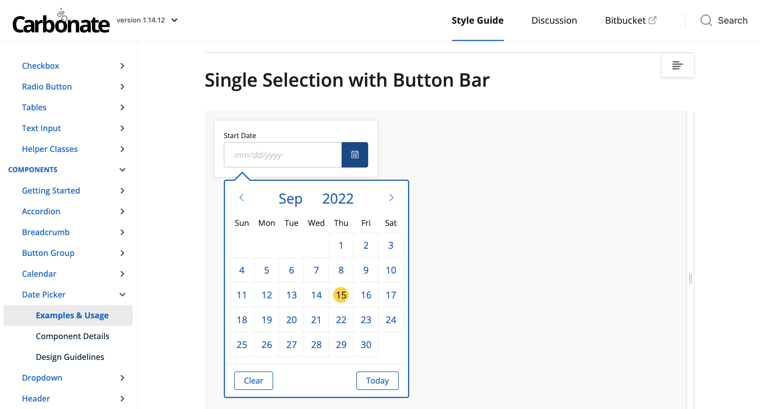
Provider Day-Planner Redesign
Design Lead: Troy Frost
All of the in-home Health Evaluations are performed on an iPad using our own software. The user and business demands evolved over time, and we found ourselves in a 5-pounds in a 3-pound bag situation.
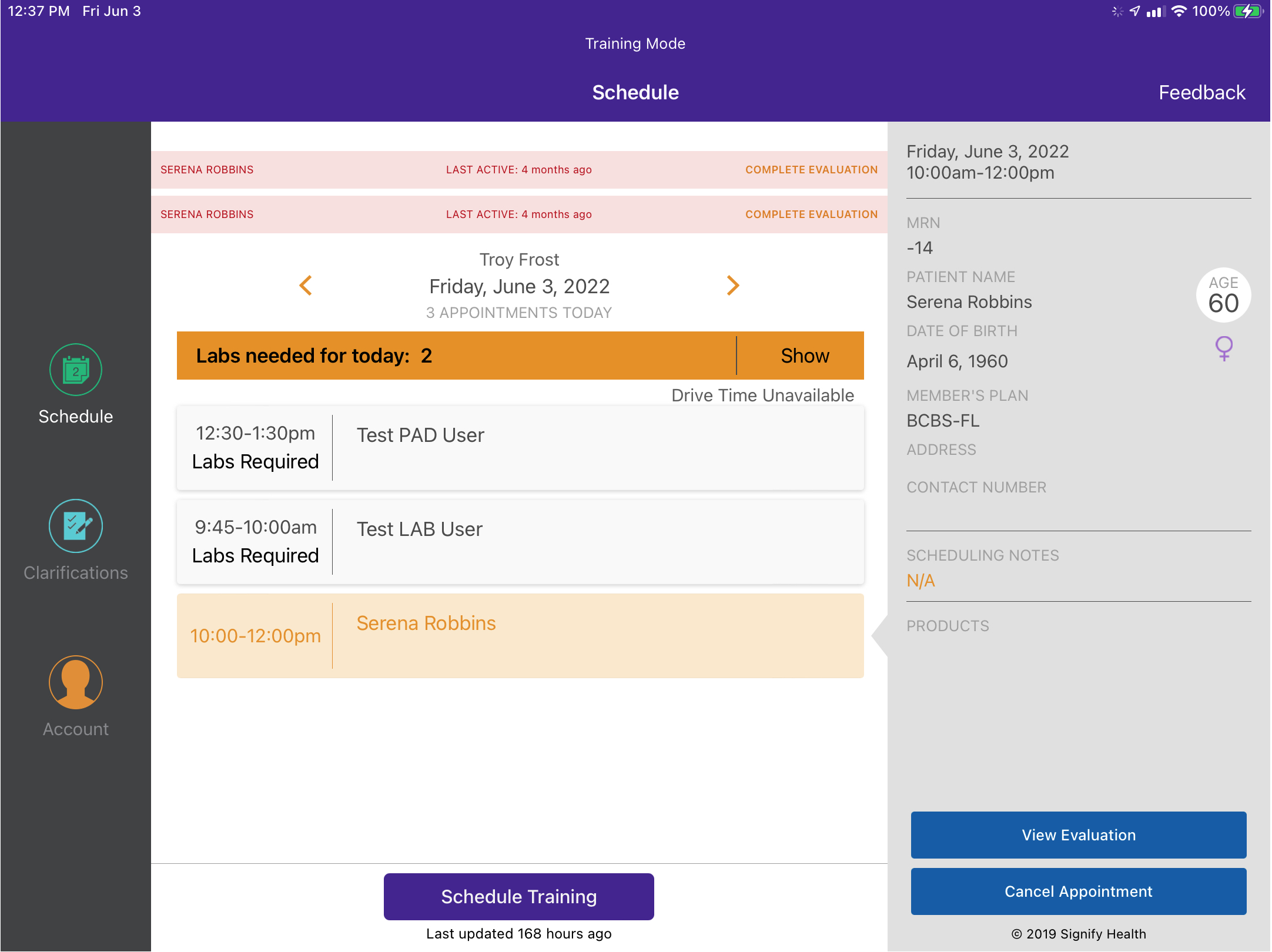
The new design provided the opportunity to transition to a Swift UI based Design System, as well as address a multitude of user and business needs. The redesign of the Day-Planner view allowed Providers to be better prepared for their visits, and be more clinically valuable while in the Member’s home.
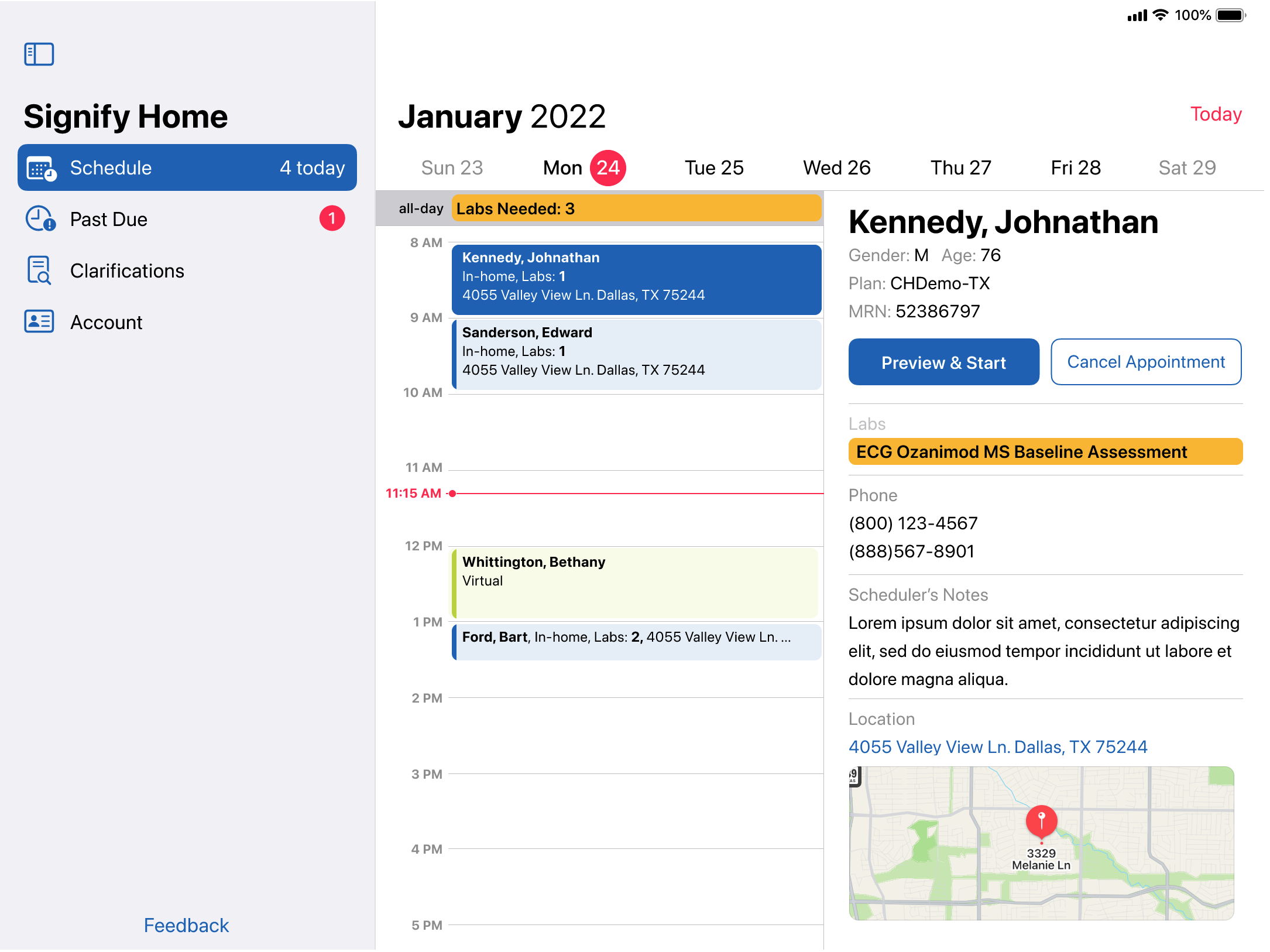
The original design of the Evaluation form was cracking under the pressure of advancing clinical needs.
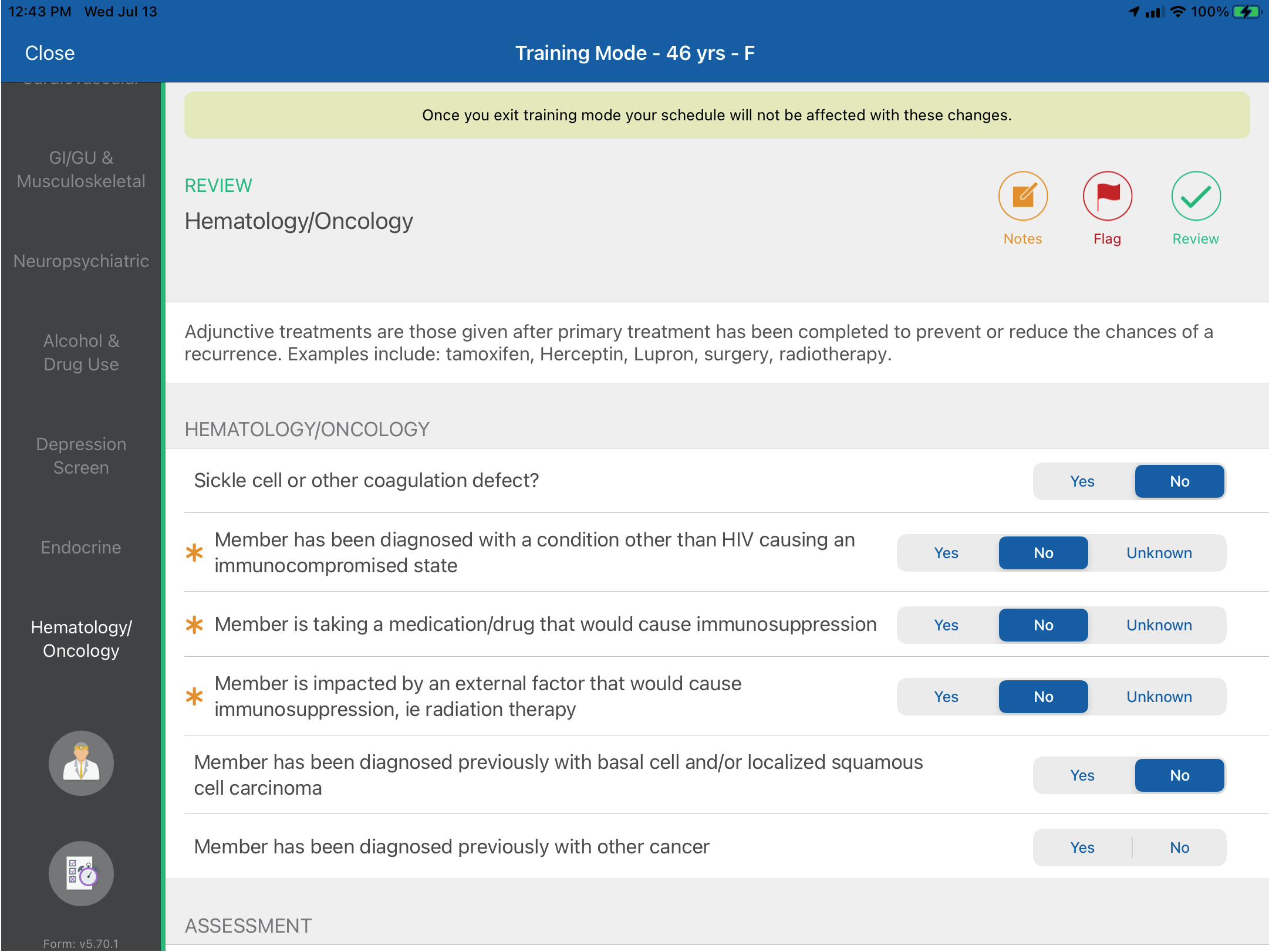
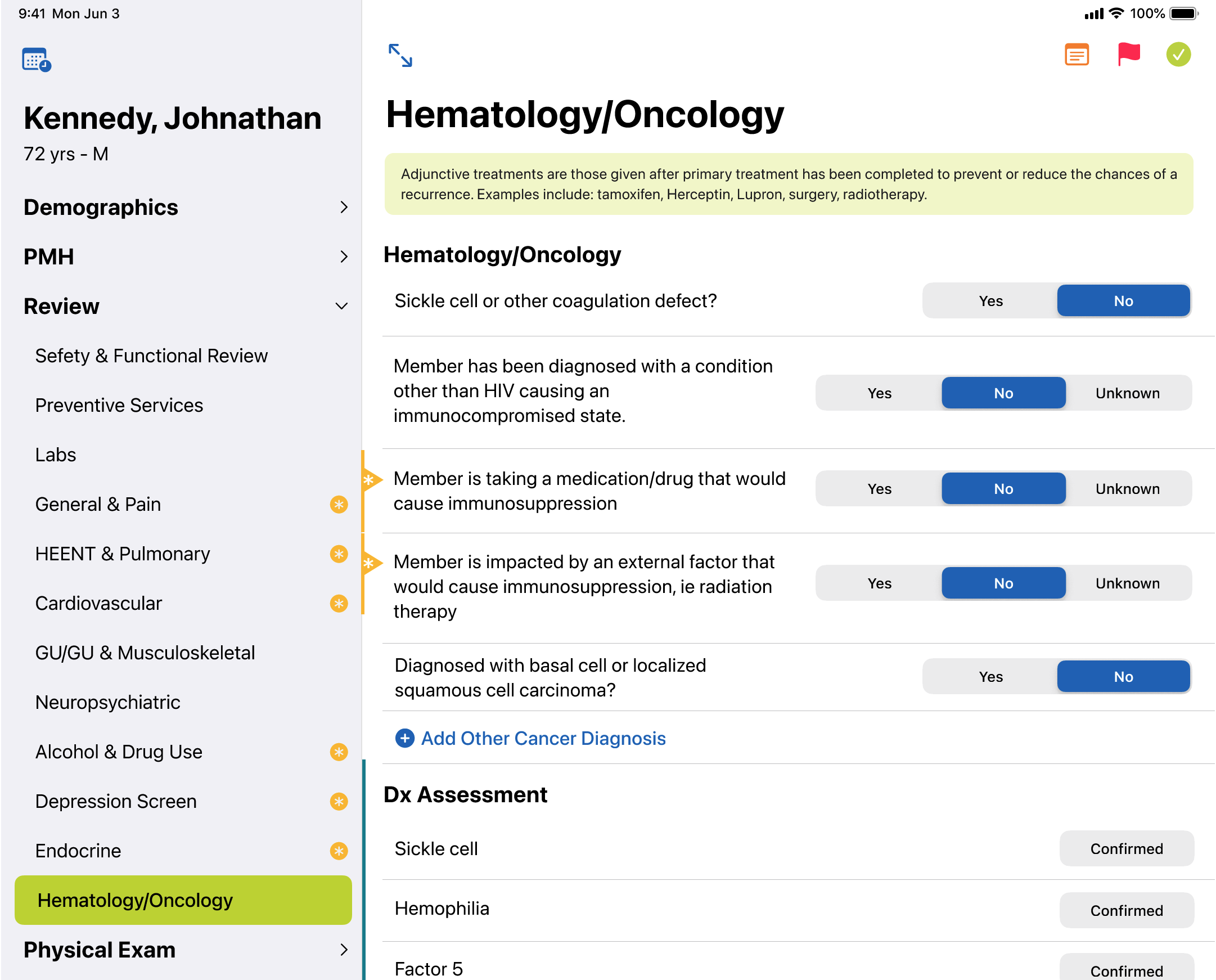
User & Business impact:
- Realtime feedback on required questions reduced needed clarifications by
- SwiftUI-based design system reduced development time
- UX Consistency across all question types reduced time-on-page
- Reduced the effort to add new questions to the form
Caregiver Journey Map
Design Lead: Jay Kuruvilla
Everybody’s day is different, and what can seem like a regular Tuesday for one person, is a life-altering tragedy for another. When we began to build tools to support Caregivers for Dementia patients, this journey map was a fantastic resource for the whole team to gain a more detailed and empathetic understanding of the Caregivers. This template was built out in Lucid Carts so that we could easily share it with teams out of Design/UX and this was critical so that EVERYBODY could contribute more detail and texture to this document.

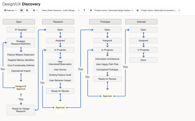
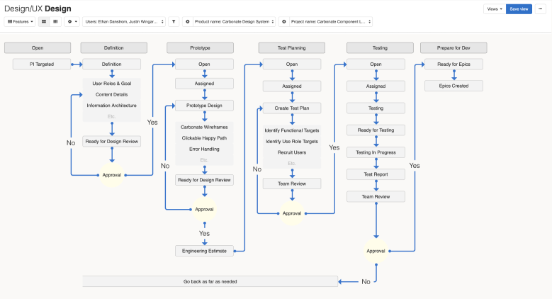
Enterprise Design Operations
Design Lead: Me
The tools for design are constantly improving, including Design Operations. Typically a RACI document does a great job of telling who is doing what. Sadly it loses the big picture of what the heck we are REALLY doing together. We built out this diagram to describe who is involved at each of the stages, and where the decision gates should be. This diagram also was a great way for non-design people to know when to involve Design, and what to expect from them when they get there.
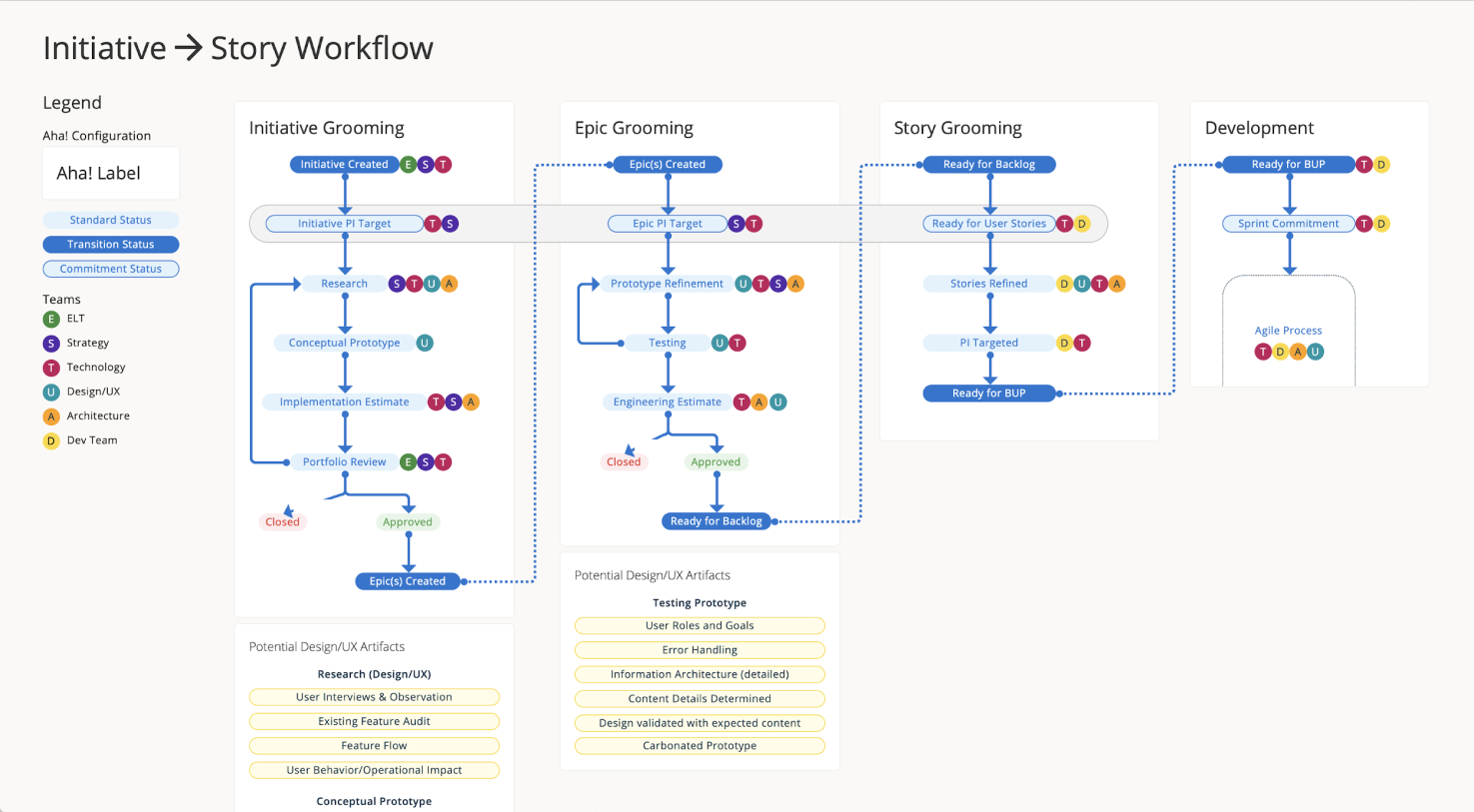
We collaborated closely with Product and Technology Leadership so that this document was a source of truth for how everybody wanted to work together. It was exciting to see it cherry-picked and showing up outside of Design Presentations.
There was a followup effort to break things out into greater details so that we could configure Aha! to work the way WE wanted to work.
Provider Availability Management
Design Lead: Yolanda Ladia
We can’t book any appointments without having open appointment slots available, and this was REALLY a moving target because Providers changed when they wanted to work a LOT. These updates fell to the recruiting team and the tool they were using was really cumbersome and error prone.
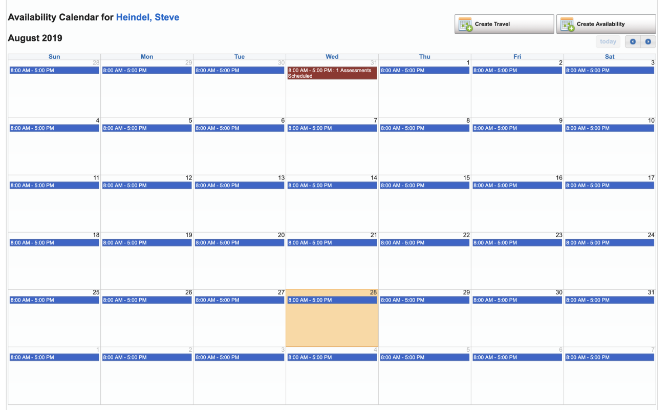
We interviewed multiple recruiting teams and their managers to better understand their current workflow and obstacles. The biggest opportunity was to reduce the scroll hunting and put the most critical information face up (or just one tap away).
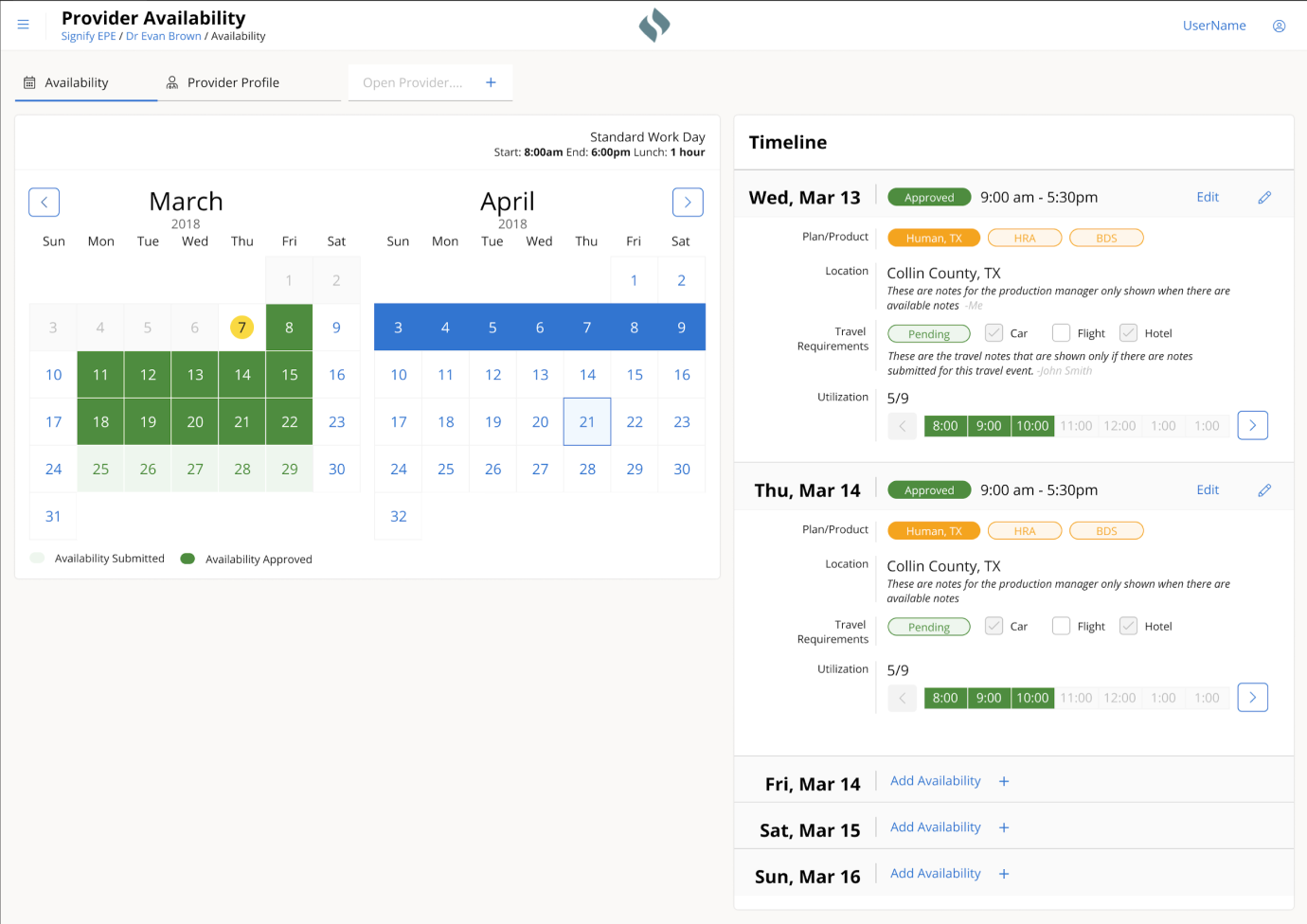
New Feature in the new design:
- Color-coded status for availability & travel
- Availability templates for each Provider
- Lunch break support
- Auto weekends
- Bulk plan assignment
Benefits of Carbonate Design System
- Improved legibility
- consistent interaction patterns
- Improved responsiveness
- Reduced initial page load time
Business Impact
- 25% reduction time to enter capacity
- 50% reduction in response time to Provider requests
Call Center Software Redesign
Design Lead: Yolanda Ladia
The Member Engagement Coordinators (MECs) called thousands of Members each day to book a home for a Health Evaluation. Booking an appointment required the MECs to gain the Member’s trust, and the more the software could step aside and let the MECs have a natural conversation, the better.
Original Design
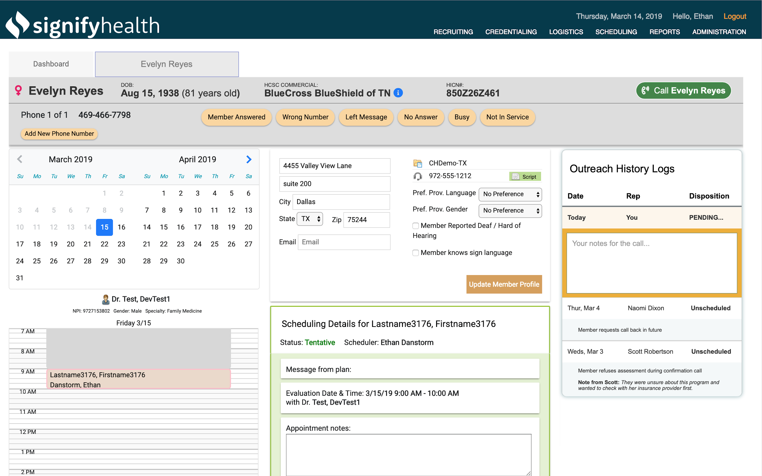
Multiple teams built the original design over numerous years, and it showed. The UI was a grab bag of various libraries, and the growth in capabilities had introduced many friction points. Through UX Research, the MECs told us what would make them most successful, and using our newly minted Design System (Carbonate), we could deliver it with speed and consistency.
New Design
New Feature in the new design:
- Multiple appointments for the same household (spouses)
- Multi-day view of available appointment slots
- Improved email capture
- Improved address validation and landmark support
- Strategic overhaul of Member Notes and Location notes
- Improved accessibility of Outreach History logs
Benefits of Carbonate Design System
- Improved legibility
- consistent interaction patterns
- Improved responsiveness
- Reduced initial page load time
Business Impact
- 2% reduction in cancelations
- 85% increase in email capture
- 25% reduction in Average Handle Time
- 15% improvement in appointments per call
Shaving scope & Minimum BUYABLE product

Keeping things high & tight..
I am a frugal guy, much to the dismay of my kids. I have been using Harry’s razors because I like the design & the blades are not too costly. Unfortunately, Captain Cheapskates still uses the blades far beyond their suggested lifespan. Recently, I bumped into an article about safety razors and this checked a few boxes for me.
- Super cheap blades (a penny a piece)
- Heavy metal razor
- A chance to add a little more “shaving zen” time to my morning.
Down the online research rabbit hole I went…reading a bunch of articles about different styles, brands, handle lengths. Then on to forum discussions about how “aggressive” each model was (no idea what that means, but sounds scary). I was drawn to the REALLY nice German brands that weighed in between $50-100 USD. This felt like a pretty big commitment for something I didn’t know if I would really use or like….I paused with my finger over the checkout-button What is the ROI on this fancy pants razor?
I backed up and started to look at what is the least costly setup I could get to just TRY this out. I found a $15 model (that even came with 5 replacement blades) and I took the plunge. So far I have REALLY liked it. The blades are great, and I only use them for a couple of days before I drop in a fresh one. Turns out I am really liking this $15 razor and it is luxurious using a fresh blade whenever I feel like it. I will see if I can squeeze Santa for a fancy one sometime in the future.
I have used the same general methodology in software design when it comes to new features. Most times there is a dream version of a new feature that is totally seamless and integrates with EVERYTHING. Usually there is a more basic version that could launch that might not have calendar integration, text alerts and in-app messaging, but it does WORK. This is a Minimum BUYABLE Product.
Example: you want to give customers a way to purchase private coaching when they reserve a gym for basketball practice.
Ideal solution would let the customer select a coach from a vetted list of coaches. Each of these coaches would have an account on the system that includes some sort of account for them to received payment into. When your platform processes the payment it sends the coaches money (minus the service charge), sends the coach and alert they have a booking, makes the booking on the calendar so they don’t get double booked….and on and on. This idea sounds like a good one, but is going to take a lot of work to launch.
Minimum BUYABLE version
During checkout you present the customer a simple link “Need a coach?” this goes to a directory page of coaches in the area. You can then track how many customers actually click the link, and you can follow up with the coaches and find out if they are getting consistent bookings from your facility.
Now you are able to test your IDEA out in real life before you make a huge development commitment. Most products have direct business impact and at the end of the day can be tied directly back to revenue. If you can get SOME money handed over for a new feature then you have some concrete behavior to use as you budget your future roadmap.
User interviews are great for research and getting solid insights on users expectations, but users are big giant fibbers when they are asked to estimate anything about their own behavior.
They might SAY they will pay for something, but until somebody hands over some actual currency (be it the folding kind or the attention kind) you don’t really know for sure. Give them a chance to put their money where their mouth is in real life as quickly as possible.
Adding web fonts to Axure Team projects

I recently started using the Flat UI Kit by Marc-Oliver, and really helps build good looking prototypes quickly. I needed to add a couple supporting fonts to a new install of Axure to have the icons and text render correctly, and since I am working with a new team I wanted to get this setup up correctly. There are a few different methods for using web-fonts when you publish a local file, but I wanted to set something on the Team Projects I am hosting on Axshare.
There are a couple of steps to this, but it should only take 5 minutes.
Step One: Gather the URL of the web font
Select a font and then find the URL for your particular web font.
This is the google set-up, but most services will be very similar
What we want is this little snippet:
<link href=”https://fonts.googleapis.com/css?family=Roboto” rel=”stylesheet”>
Copy that to your clipboard.
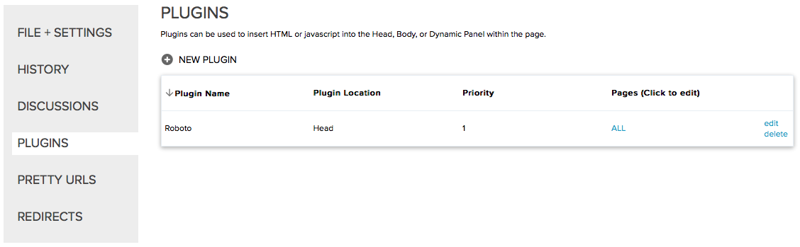
Step Two(ish): Create a Plugin on Axshare
Login to your Axshare account via the web (no idea if this is possible via the app). Find the project you want to add the font to, and select the Plugins link from the configure gear thingy.
On the Plugin screen click on + Add Plugin and then paste the snippet that included the web font URL content section. You can name your plugin whatever you want, but I find the font name is the easiest.
Then hit Save.
Add the plugin to all the pages AND all new pages by default if you want to use it for all page (not a lot of reason not to as far as I can tell).
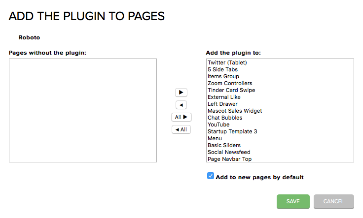
Then hit Save.
That is it. You now should see your shiny new plugin displayed on the plugin page for this project.
Next time you generate a new prototype with a fresh Team Check-In you will now have the markup to include this snippet on all your pages.
Note: You will have to do this for each team project you are adding the font to. I haven’t found a way to set this up as a larger account/group level rule.
Any questions or comments directed to @atimefordesign, please.
How to set up a google calendar for your class
For a student to thrive they need the parents and the teachers working in unison. The single best tool to do this is a shared calendar. 15 minutes of setup and I assure you the kids will turn in more of their work on time and the parents will be forever grateful for making it so simple to be an active part of their child’s education.
Most of my children have been using the google platform so these instructions will be centered around that. If you are on another platform just search/ask around for help setting up a “shared calendar.” The screens will be different, but the process will be very similar.
Google Calendar?
If you have not used the calendar feature offered by goole before I am not surprised. The current version hides it away a little bit. If you know where to find it, it is not much of a Waldo. Navigate to your email screen and click on the grid of squares in the upper right hand corner.
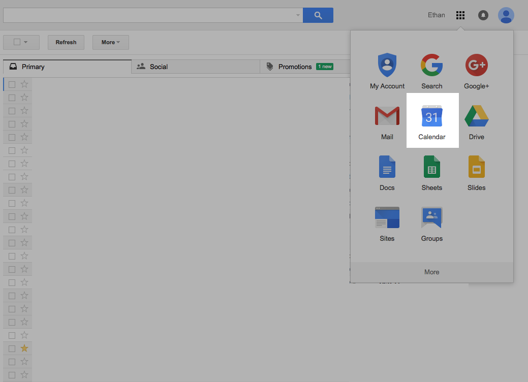
Click on the grid of squares in the upper right hand corner of google mail on the web and you can click on the calendar to access the calendar tool.
Once you are there you can create your first shared calendar. There is small button along the left hand column that will give you access to the first step in creating your calendar.
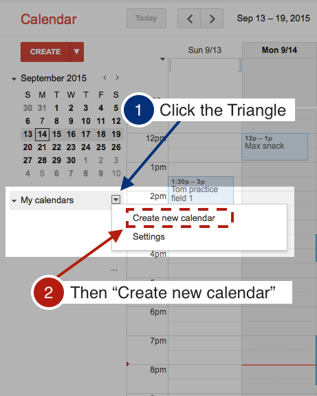
Step one of creating a shared google calendar
The next screen is where you will set up all of the attributes of the calendar.
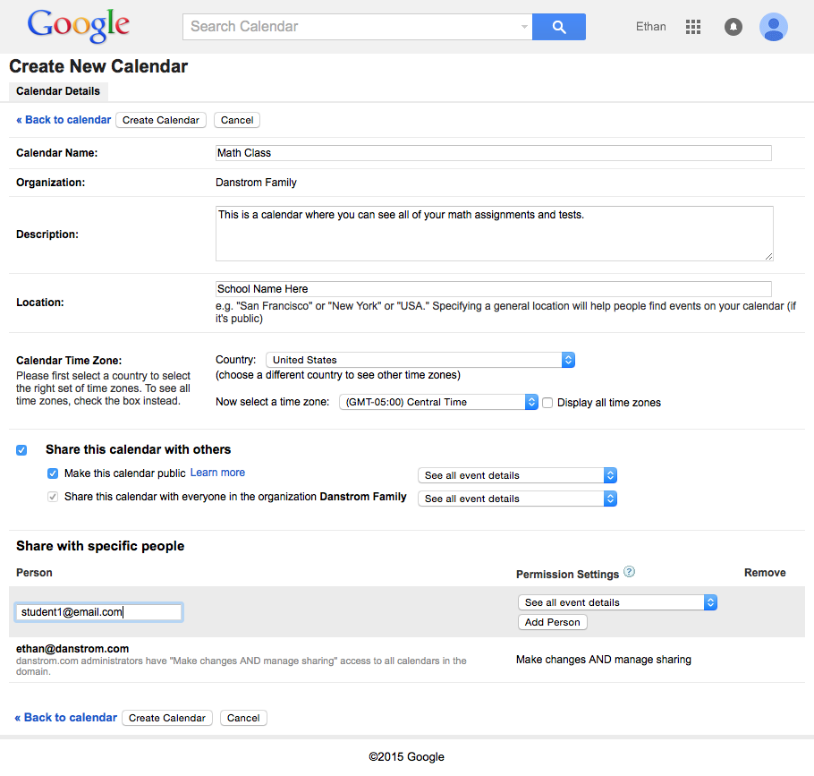
Attribute screen for creating a shared google calendar
Calendar Name: This is what will show up as the calendar name. People will be able to hide and show your calendar in whatever application they use (outlook, iCalendar, etc.). Name it something they can easily understand: “7th Grade Math” “Mrs. Smith’s 1st Grade” You do not need to add the word “calendar” They will be viewing this in their calendar and the extra word will get cut off.
Organization: This will likely show up as your school name. I use google apps for my family which is why you see my name in this screen shot.
Description: This is where you can talk about your class in general. It is also a good place to put your contact info so that parents will have it right at hand should they have a question about any events or assignments they see in your shared calendar.
Location: This is not super important, just put tour school name here.
Calendar Time Zone: This should be correct by default. Just make sure that it has the correct country and timezone.
Share this calendar with others: This box should be checked so that others are able to access the calendar information you are sharing with your class.
Make this calendar public: I would suggest that you make this public. Making it public allows parents to share the calendar with others. If you are concerned about it for any reason you can leave it unchecked and add each parent to the calendar manually.
Share your class events with ease!
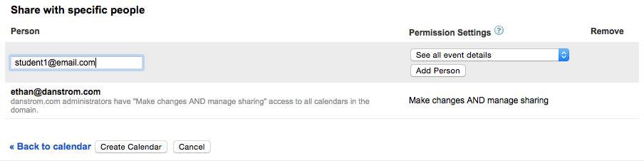
This is where you will add all of your parents/students to the calendar. They will all receive and email with a link that will add the calendar to whatever calendar application they prefer to use.
Person: add in the email address of the person you would like to add
Permission settings: Make sure this is set to see all event details. This will let them see the notes and attachments that you include in your calendar events. DO NOT select any of the other options. You do not want students or parents to be able to change events or add them. The default setting is what you should select here.
Add Person: Once you click “Add Person” they will be added to the list. You can quickly copy & paste each of the names from your current email list in here. If you paste in the entire list in the small box and hit “Add Person” it will automatically pick out each individual email. You can add your entire class in about 5 seconds.
Create Calendar: Click this once everything is filled in. You can always come back and change anything on this screen.
If you have made the calendar public there is a warning that it is really public. Click yes to proceed.
For students or parents that are not using google calendar you can send them a link that works for almost any calendar application.
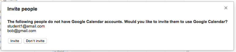
Add non gmail email accounts to google calendar
Click “Invite” and you are all done creating your shared calendar!
I will write up a quick page for creating a shared event next.
Happy teaching!